
Case Study
Lifeline Assistance / Brand Identity / Campaign System / Visual Recognition
Lifeline Assistance
Building a recognizable brand identity system that could stay consistent across digital, social, print, and campaign touchpoints.
Challenge
The brand needed to stay recognizable across every campaign and customer touchpoint.
Lifeline Assistance needed a brand system that could create trust, recognition, and consistency across digital, social, and print materials.
Without a clear system, each campaign risked feeling disconnected. The opportunity was to create a visual foundation that made the brand easier to recognize wherever it appeared.
Goal
Create a cohesive identity system that could build confidence, trust, and recognition at every touchpoint.
The goal was to define the essentials — logo, color, typography, imagery, and visual applications — then extend them into a consistent system across campaigns, social graphics, print pieces, and digital materials.
Strategy
The identity had to feel clear, trustworthy, and easy to repeat.
The strategy focused on building a practical visual language that could scale beyond a single logo. Each element needed to support recognition, consistency, and flexibility across different formats.
Execution
The brand system was extended across identity, campaigns, print, social, and digital applications.
Brand Identity Foundation
The identity system established the core visual elements needed to make the brand recognizable, including logo usage, color direction, typography, and consistent design treatment.
Campaign Recognition
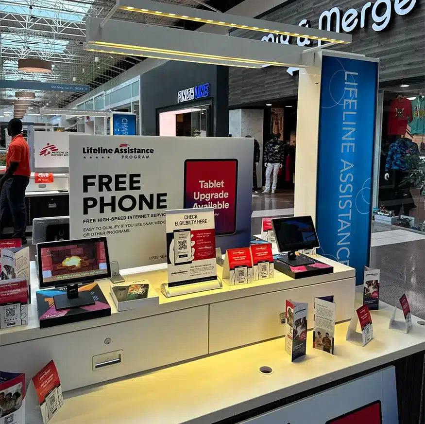
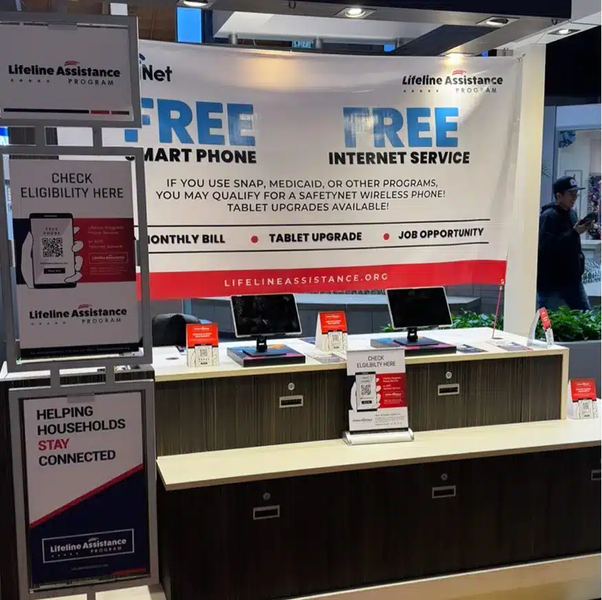
Campaign visuals were structured to feel connected, helping the brand stay familiar across different messages, layouts, and marketing moments.
Digital & Print Applications
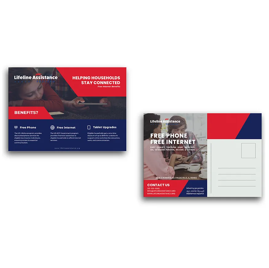
The system was extended into print and digital formats so the brand could maintain the same presence across online campaigns, physical materials, and customer-facing communication.
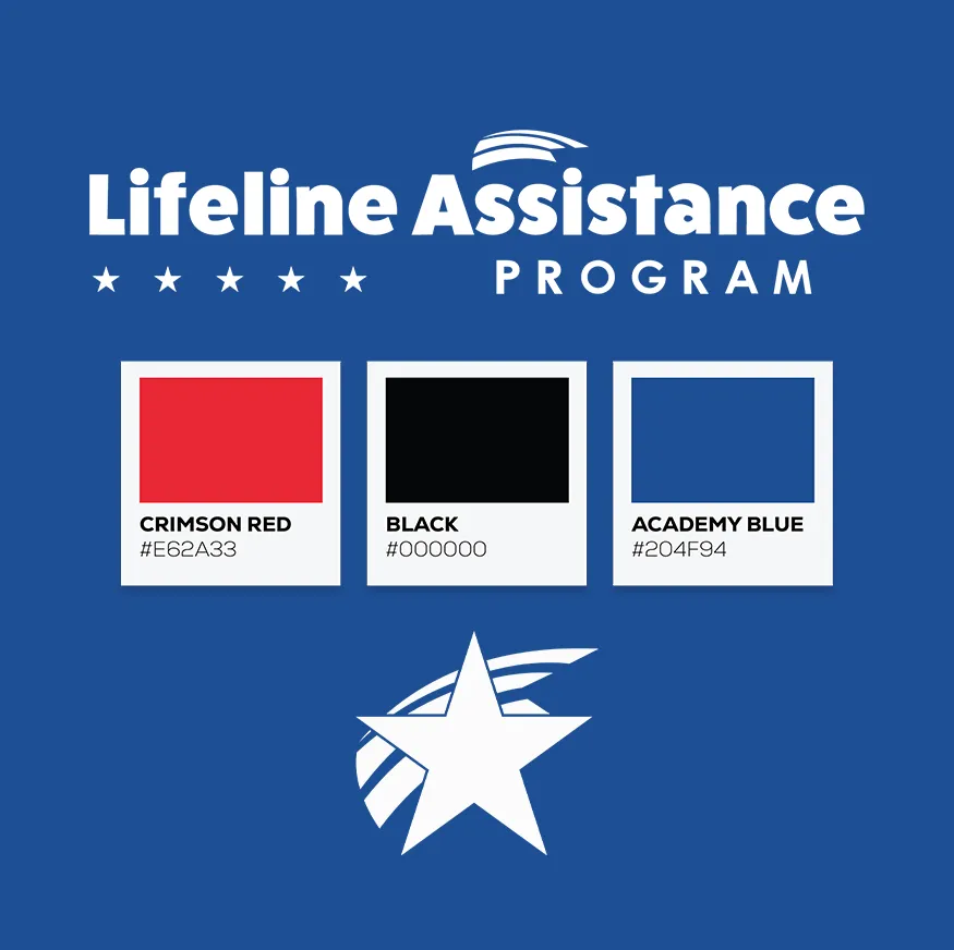
Social Media System
Social visuals were designed to support recurring brand recognition, giving the brand a consistent presence across posts, promotional graphics, and campaign updates.
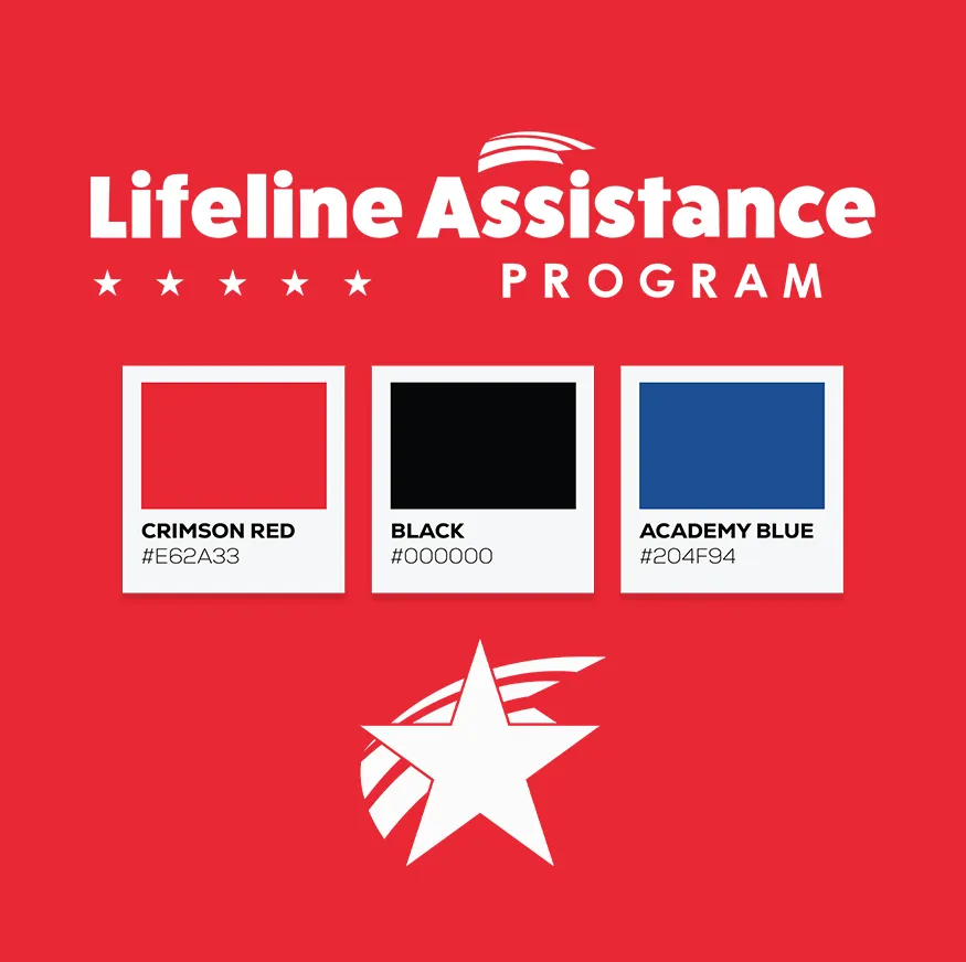
Brand Extension
Additional branded layouts helped the identity move beyond a single design and become a flexible visual system that could support multiple campaign needs.
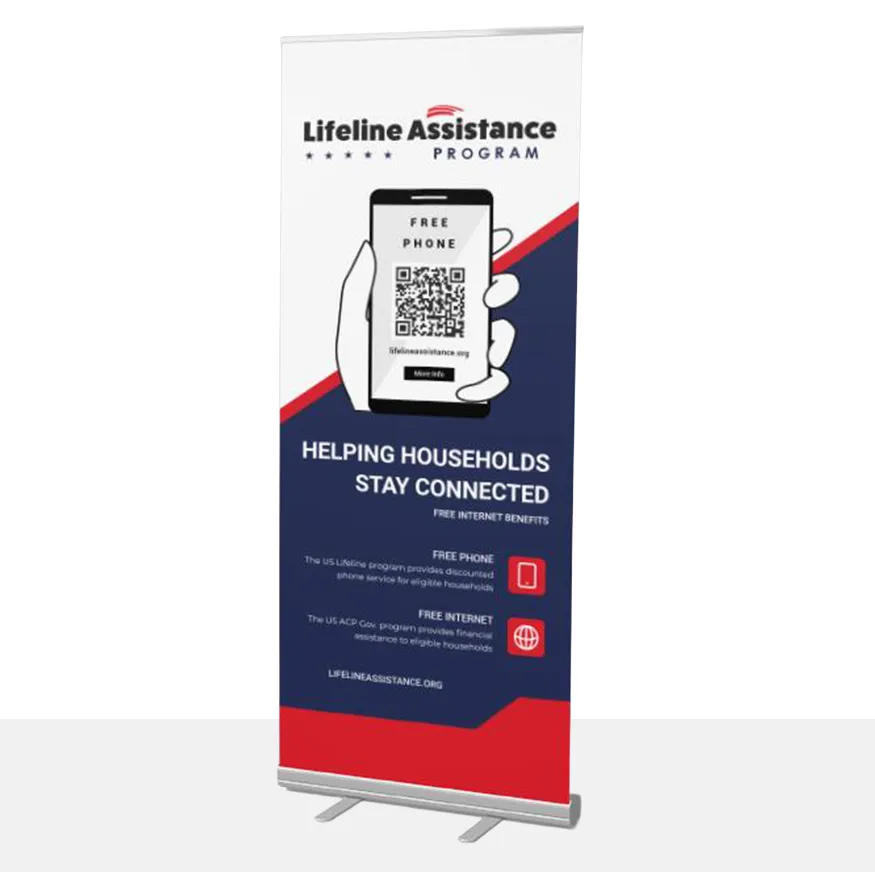
System Consistency
The final system connected the essentials — identity, color, type, layouts, and applications — into a cohesive presentation that could build trust across every touchpoint.
Visual System
A recognizable identity applied across campaign materials.
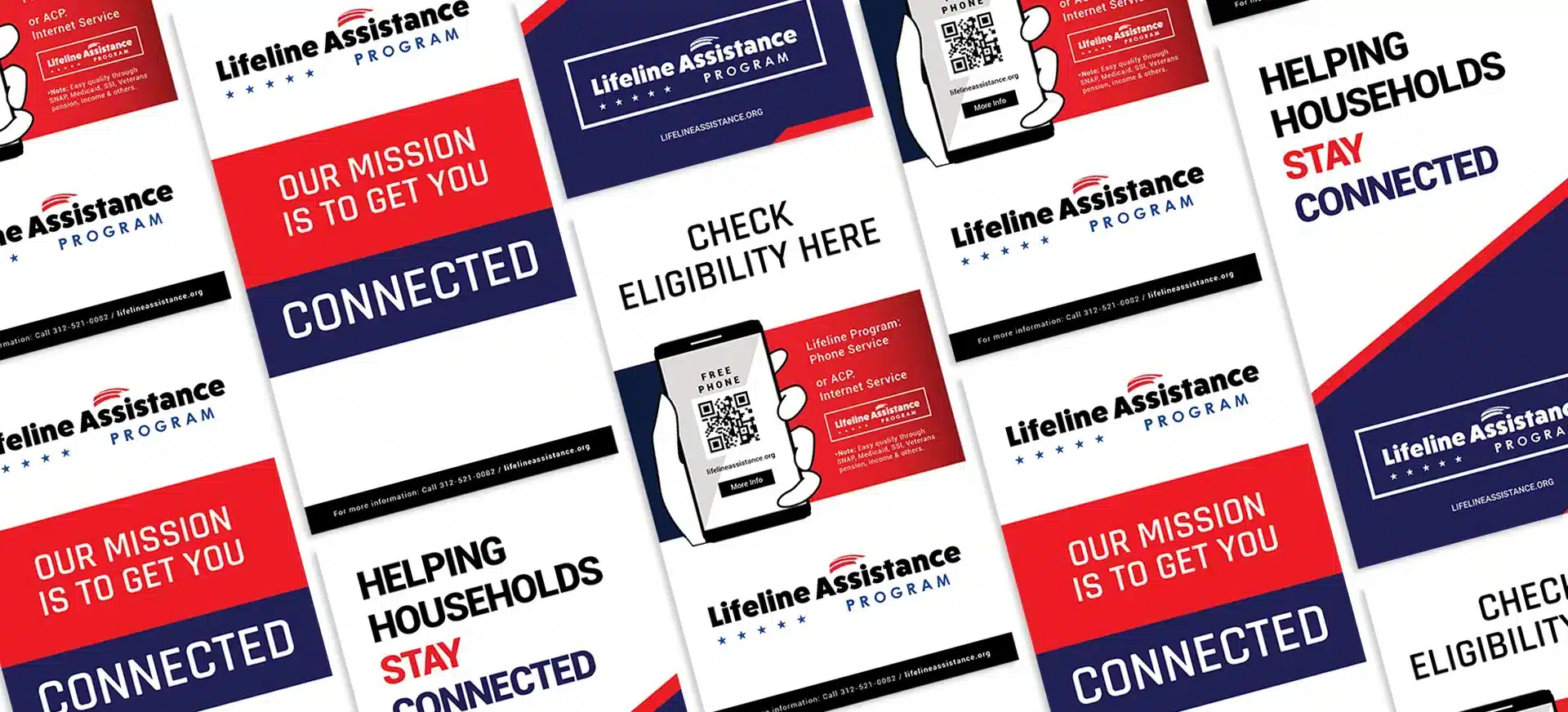
Results
A cohesive identity that builds recognition, trust, and connection at every touchpoint.
Takeaway
Recognition is built through repetition, consistency, and a system that can travel.
Lifeline Assistance demonstrates how a brand identity becomes stronger when it moves beyond a logo and becomes a repeatable system across campaign, social, print, and digital environments.
Brand System
A visual identity system designed for campaign consistency.
Next Step
Need a brand identity system that stays recognizable across every campaign?
Start with a strategy review to clarify your identity, customer touchpoints, and the visual system your brand needs next.
Book a Strategy Review